Rhythm connects us all
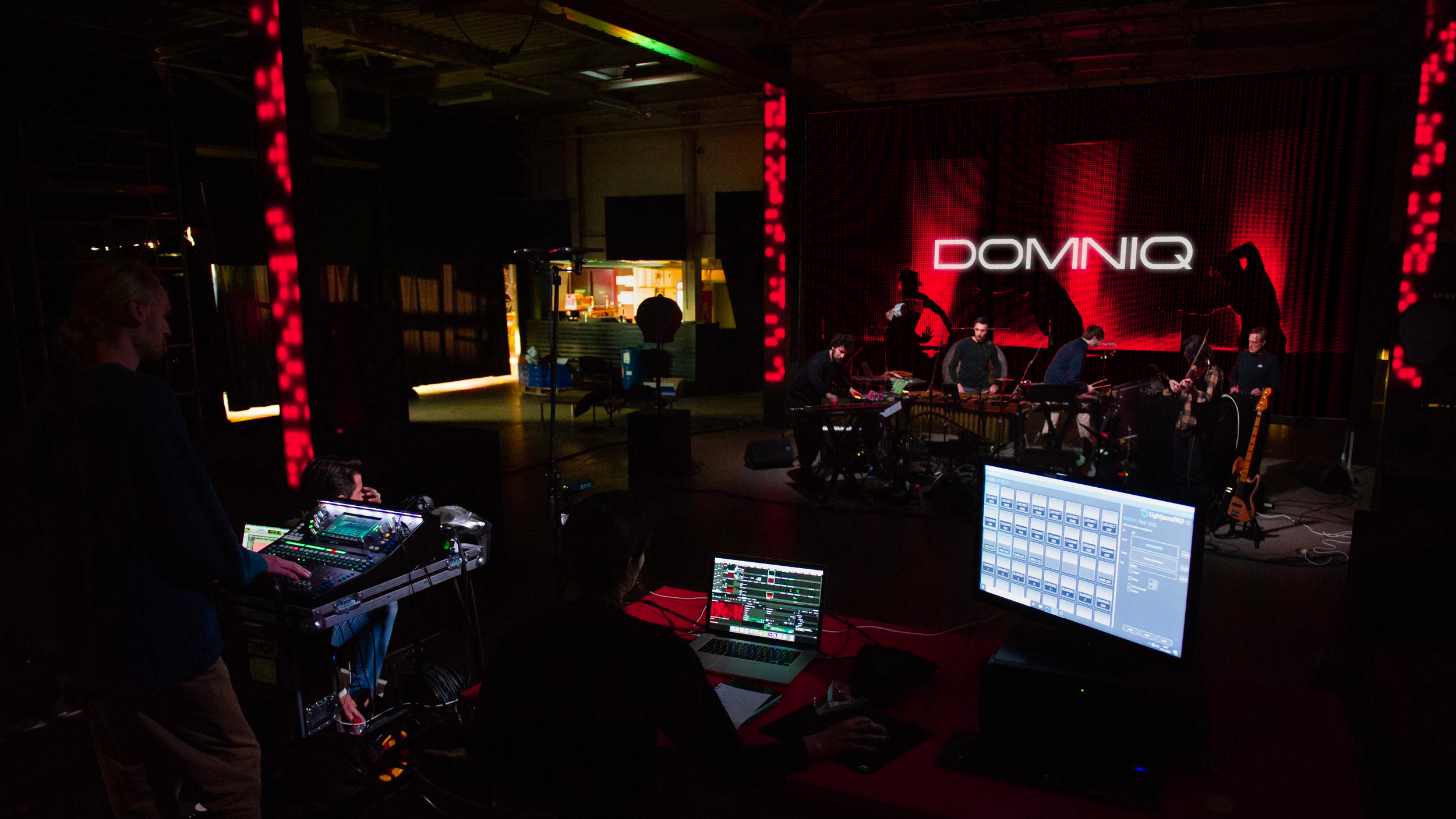
DOMNIQ is a multi award-winning master of experimental percussion. Seamlessly blending modern classical influences with an innovative fusion of electronic sounds.
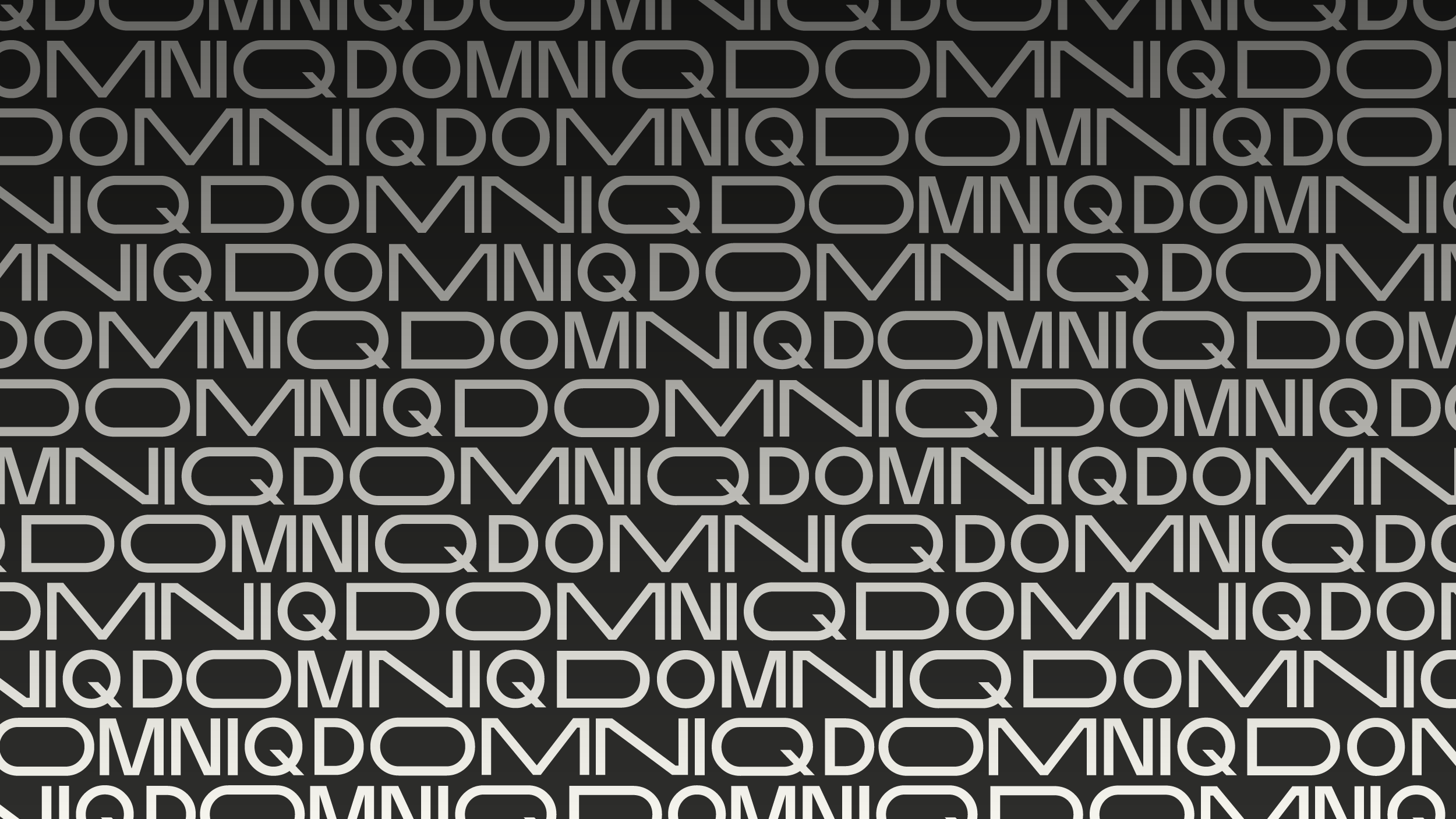
We wanted to create a visual identity that matched the experimental and eclectic nature of his creative output. At the core of this idea was a typographic mark that could be loud and experimental – representing his innovative electronic music – but could also become refined and understated as required – mirroring DOMNIQ’s classical influences and training.
The result was an identity routed in kineticism, a brand that could distort and transform in response to its environment or sound – a brand that was always in motion, able to change and evolve to create endless variations and ways to surprise.
A collaborative endeavour
The creation of the DOMNIQ identity was a fascinating collision between visual and audio design – when we approached DOMNIQ with the concept of an identity that could respond to music, he responded by composing a suite of musical loops and sounds that responded back to the visual design and wordmark. Thereby creating a joyous feedback loop whereby the visuals influenced the sound, and the sound in turn influenced the visuals.

Morse code and musical notation
DOMNIQ responded by taking the letterforms from his name and transpose them into morse code – creating a sequence of dots and dashes – that formed the basis of a beat sequence.
This underlying rhythm was then used to compose music samples – this time taking each letter (D-O-M-N-I-Q) and assigning its position within the alphabet with a music note.
The output from this experiment was the creation of a sound identity that was intrinsically linked to the visual identity.
Call and response
With DOMNIQ’s sound identity in-hand, we were then able to truly explore the power of a kinetic wordmark that responded to sound – each letterform could stretch and compress in direct response to the audio input, creating an ident that danced to DOMNIQ’s music.
The possibilities of this expression are endless, a different piece of music would allow the wordmark to respond in a different way, a classical piece might yield a softer form of animation compared with the experimental electronica that formed DOMNIQ’s current musical stylings – whichever genre DOMNIQ’s music goes next, his visual identity will go too.

Sound and vision
Much like the wordmark, we formulated a colour palette that could bring a sense of surprise and delight to the identity – a calm and collected combination of black and white as its resting state, but loud with excitement when activated.
The colours themselves were inspired by Chromesthesia, the idea that in some people different sounds can trigger a visual stimuli, and different musical notes manifest themselves in different colours. And to reflect DOMNIQ’s experimental nature, we consolidated and concentrated these hues into a palette of colours that become brilliant flashes of light against the brand’s primary Piano Black and White.


Pattern and texture
DOMNIQ’s creative purpose is born from the idea that ‘rhythm connects us all’ – it connects everyone, to everything... The whole world moves to a beat and schedule.
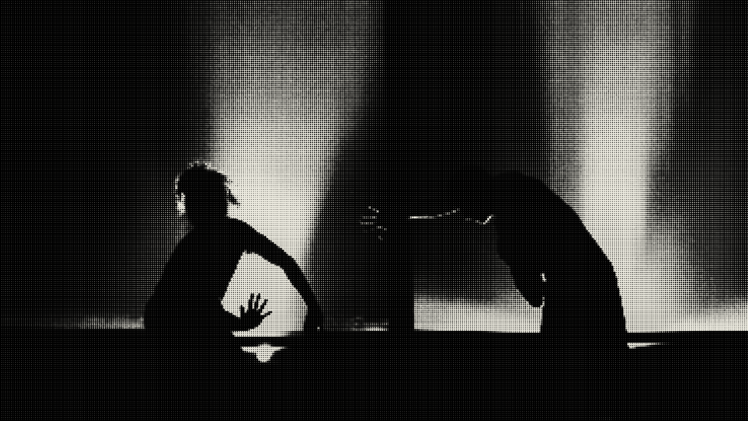
We took this idea as a method for creating branded imagery and texture. Turning photographic images into striking patterns of dots in varying scales – each one representing the underlying rhythm captured in the moment. And by creating a formula for the treatment the brand is able to take any image (or even video footage) and construct a vector pattern for use across any purpose or scale.


A platform to perform
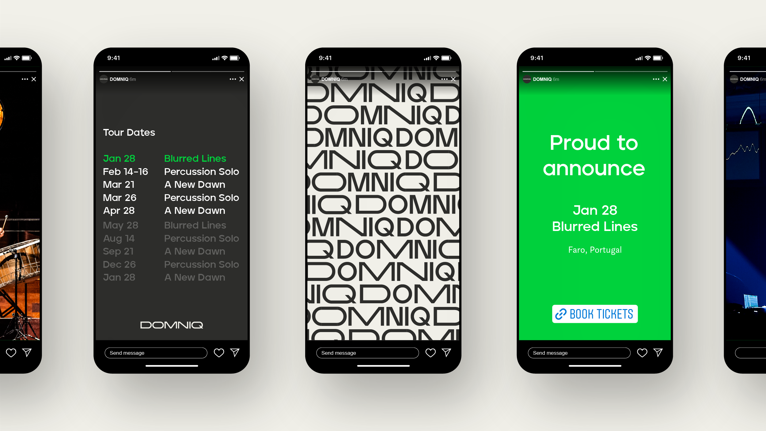
At its core, the visual identity exists to enable DOMNIQ to share passion for music with the world. To enable this we worked closely with DOMNIQ to develop a suite of social media assets that would elevate his social media feeds while unifying his identity across all of his channels.
