Take the stage
This brand embodies the confidence and integrity that shines through the people of Maestro Arts, whilst bringing the craft and care of nurturing new artists.
Elevating the visual representation of the brand to the same level of respect and ambition that shines through its people.
Memorable and striking
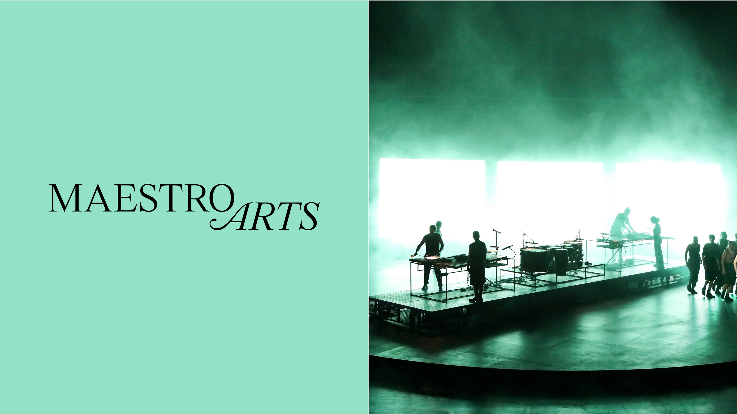
A mark that is memorable, striking and allows Maestro Arts to take the stage with confidence and the message that we are different. The mark is complimented with a monogram version, an adaptive mark that is instantly recognisable in any instance.
The mark brings together the duality between Maestro and Arts. The rigour and craft of Maestro and the Heart and emotion of the Arts, crafted with a contemporary serif that fuses precision and elegance.


A living, breathing approach to colour
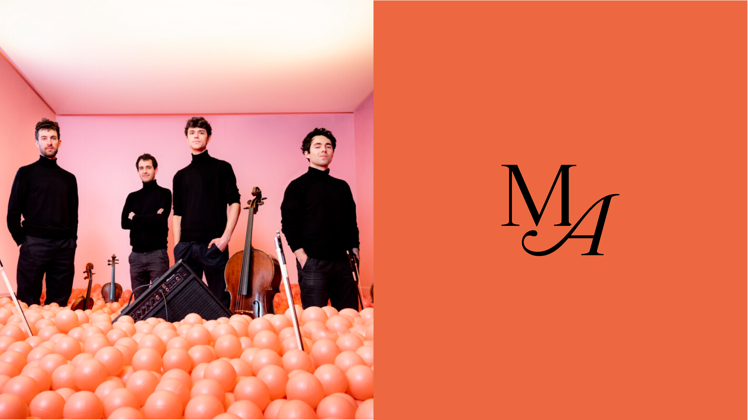
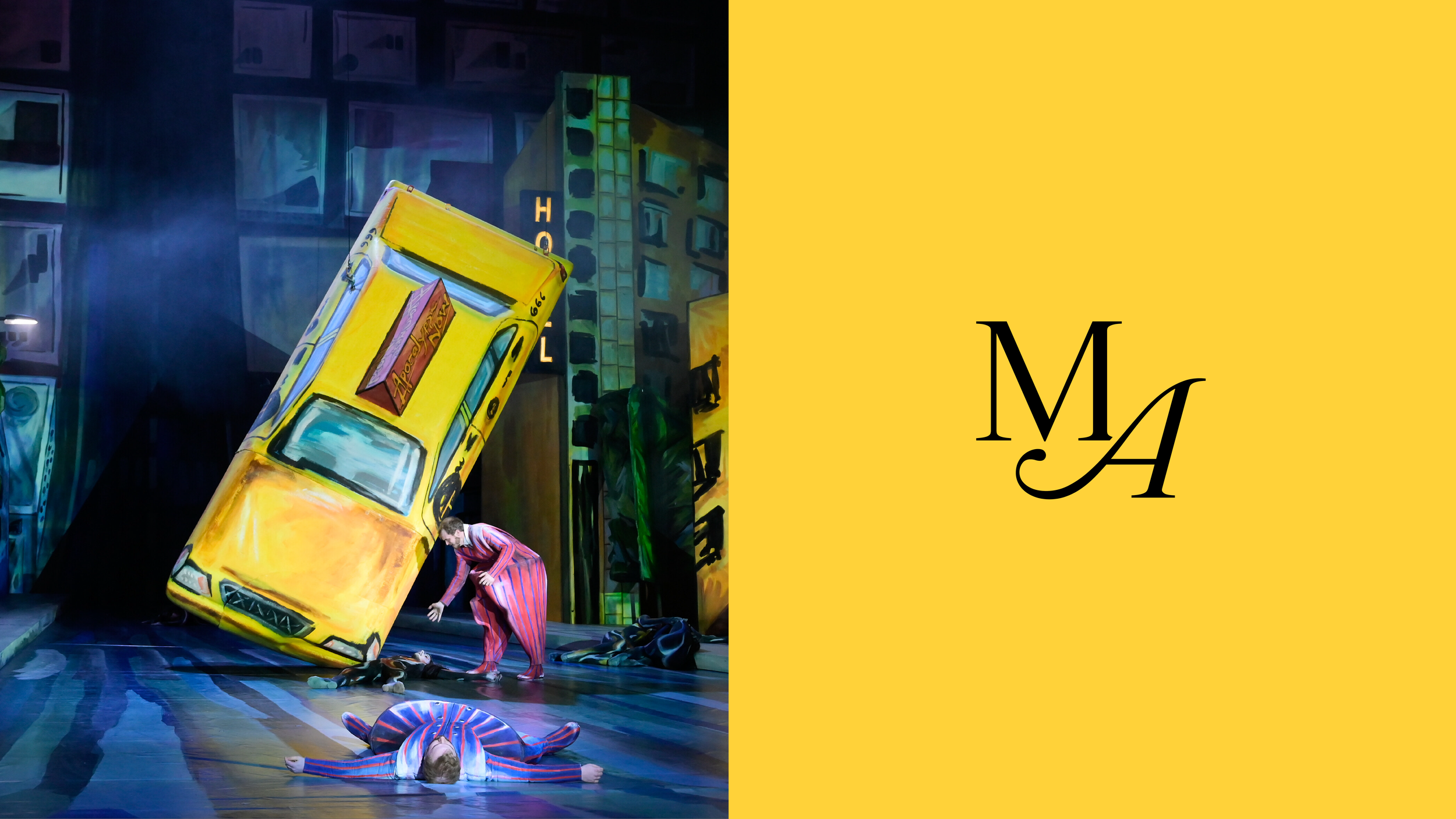
We use colours that come directly from our artists work, performances and promotional material – because our brand, is a platform for them to take the stage.


Editorial expression
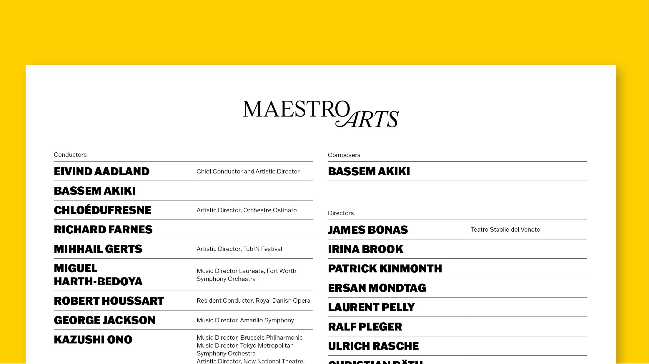
The Maestro Arts identity takes an editorial first approach bringing bold expressive typography together with dynamic layouts to create a unique voice for Maestro Arts, from web, print and social media.


Immersive stoires
Bringing the editorial voice of the new identity to social media creates a bold new voice for Maestro Arts and their artists. Allowing for dynamic layouts, bold colour and wonderful images gives the brand an ever evolving look across social channels.


